Brief(-ish) Explanation
Background
We chose to explore a food/grocery purchasing app interface. This interface would allow a user to create a grocery list based on recipes or menus provided from a limited number of sources (e.g., spreadsheet, popular recipe sites, a built-in database) and then purchase items from said list.
Project Goals
This was a design exercise, so our goals were to make a well researched, well thought out interface.
Methodology
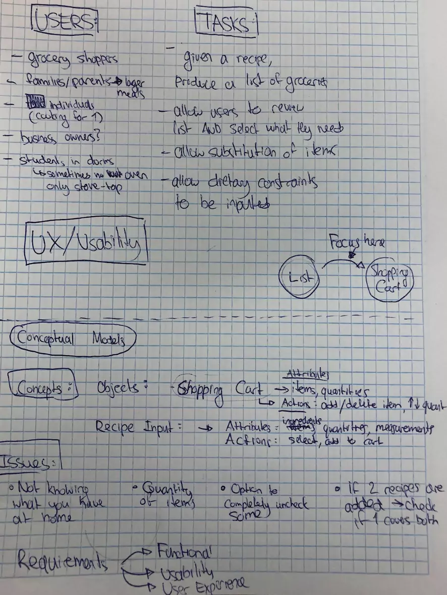
We created personas of potential users of the app.
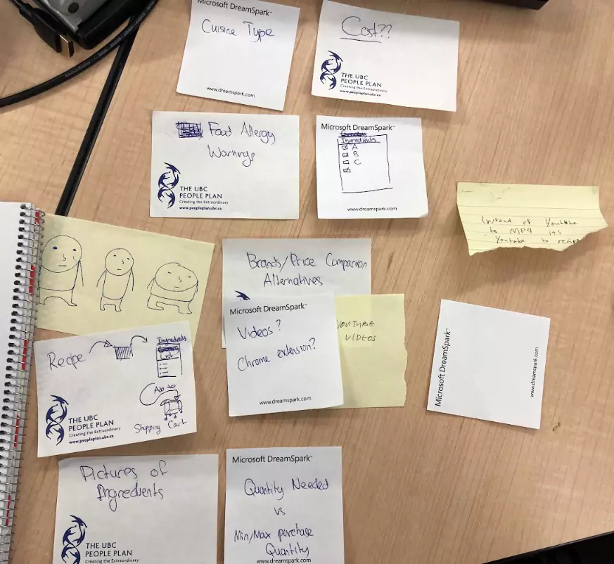
We performed our initial user research through controlled observations and interviews. We created a coding sheet and this enabled us to quickly affinity diagram and plan/analyze our findings as a group.
We made low-fidelity prototypes, with which we did some task walkthroughs to get a gauge of issues with user flow. We then made a high-fidelity prototype, we recruited participants to go through it and we then interviewed them about their thoughts.
Requirements
-
Users can turn any inputted recipe into an ingredients list.
Though this is a black box, being able to convert a recipe found online or from a recipe database to an ingredients list is the first step in creating a final grocery list. -
Users can easily cross check ingredients they already have at home and ingredients they need to buy.
Instead of the user doing calculations themselves on the grocery list to figure out the items they need to buy, this gives users a grocery list based on their logistical needs. -
Users can find different brands and/or substitutes for ingredients and add it to their list.
For example: if a user doesn’t want to use tomatoes in their recipe they can substitute in red bell peppers.
This gives users a more personalized experience and allows for additional customization and flexibility. -
Users are alerted of products with common food allergens.
By taking into consideration the food allergies listed on the user’s profile, users can save time by not having to personally check the recipes for potential food allergens. This requirement allows for efficiency in the shopping process, as well as ensures users’ safety.
Personas
For our initial paper prototyping, we created 2 personas that would inform our cognitive walkthroughs. Each persona would be used for task analysis.
Persona 1 / Task Example 1
Sam:
- College student
- Kind of broke
- Learning how to cook using YouTube
- Lactose intolerant
- Wants easy substitutions (due to lactose intolerance)
Sam is a lactose intolerant college student trying to learn how to cook. Recently, he’s been finding recipes by watching YouTube videos. Sometimes he finds it too tedious to pause and rewind the video each time he misses an ingredient or a step. He wants something that translates a video into a recipe, which will provide him with the list of ingredients needed for the dish. He then checks what ingredients he has at home and tries to cross-check it with the recipe in order to produce a grocery list.
Additionally, because he is saving money, Sam wants to compare prices between brands of the same product and put the cheaper option on his grocery list. Sam also wants to easily find a substitution if the recipe calls for a dairy product, and add that substitution to his grocery list instead.
Persona 2 / Task Example 2
Martha:
- Single mother of 2
- Has a career
- Knows how to cook
- Wants convenience in...
- Getting recipes
- Getting ingredients
Martha is a single mother of 2. She wants a quick and easy way to turn recipes into a grocery list. Instead of spending a long time browsing for a recipe online, Martha wants a bunch of recipes ready for her to choose from. She wants to save the recipes that her and her children liked. However, she wants to be able to edit the grocery list once she selects on a saved or liked recipe, since the ingredients she has at home might differ from the previous time she went grocery shopping for the same recipe. Martha typically decides what to cook for dinner while on her lunch break at work. The grocery store is on her way home from work, so she wants to be able to order her groceries during lunch and then pick it up after she is done work. She usually makes dinner after she drops her kids off at their after school lessons on the same day.
Paper Prototyping
We started with 2 paper prototypes to come up with workflow/userflow ideas, and ideate on some potential features.
Brain Storming
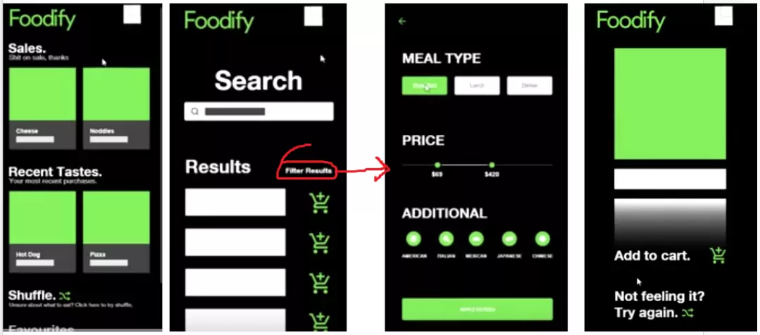
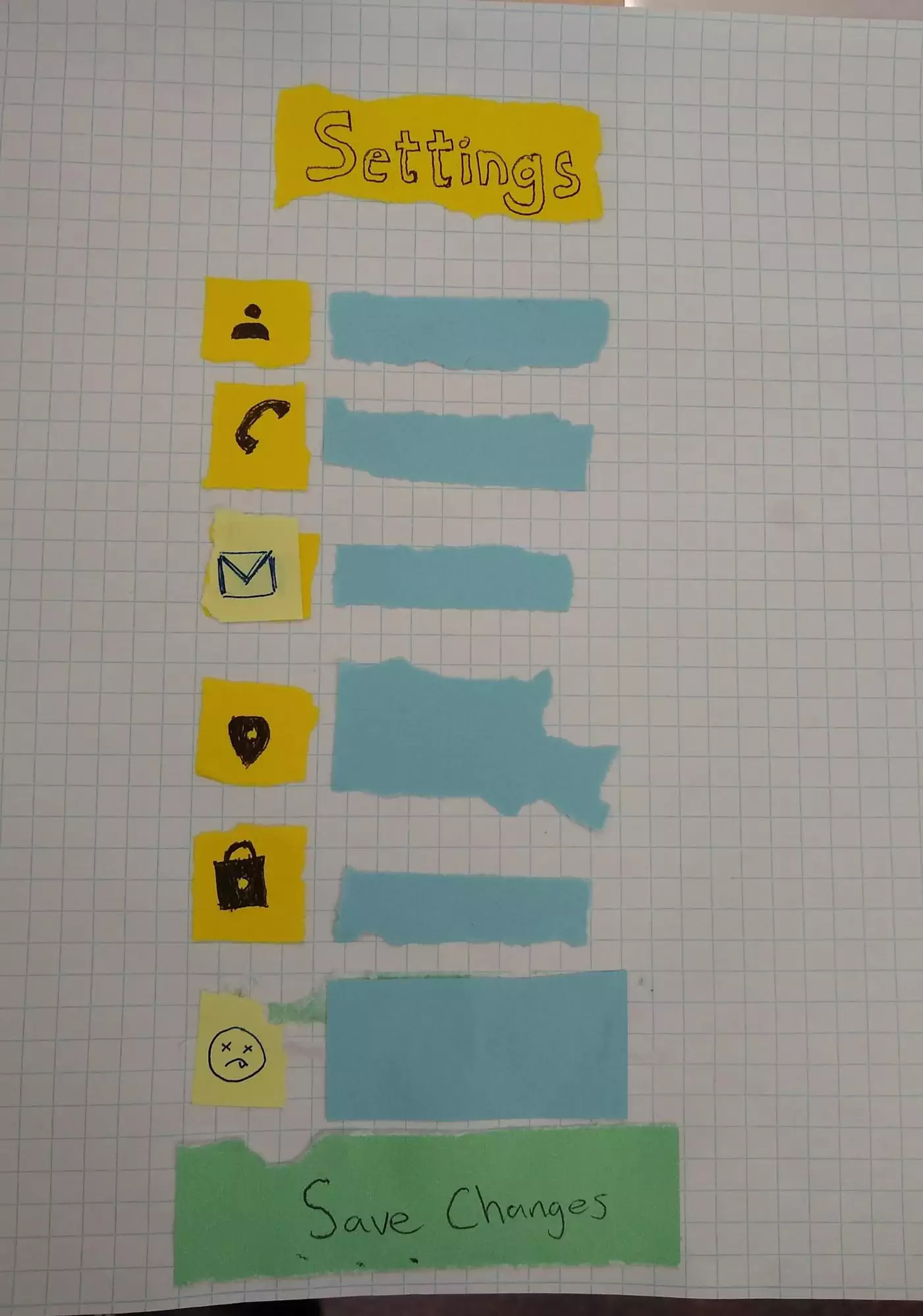
Paper Prototype 1 (PP1). Foodify V1.0
For PP1, ideas were discussed between the team and inspiration was taken from existing, notably well laid out (for the most part) apps. The initial ideas were mocked up in Adobe XD for speed and adjustability. The XD mock up also allowed for checking and understanding task flows. The paper prototype went through a bit more revision.
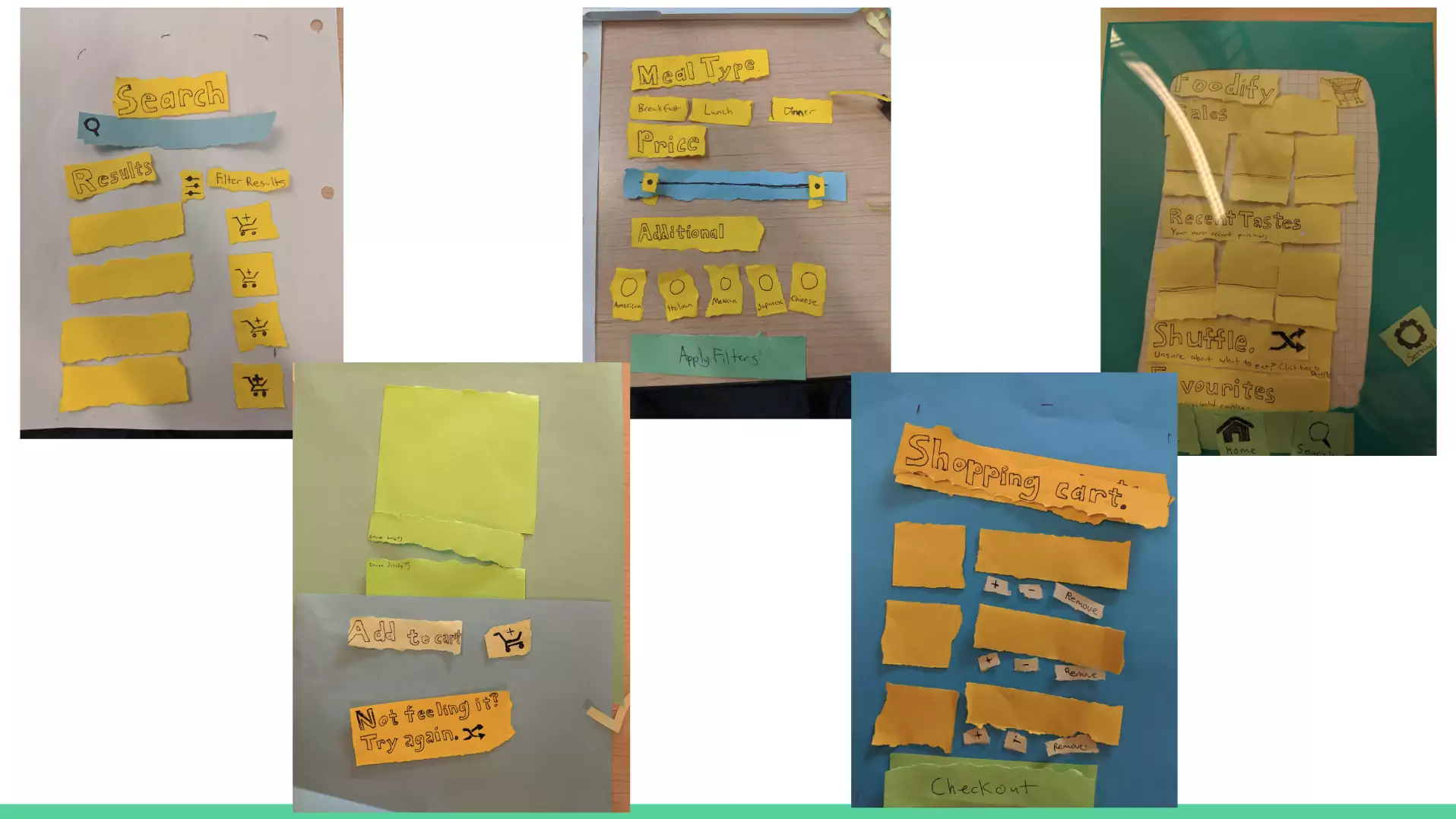
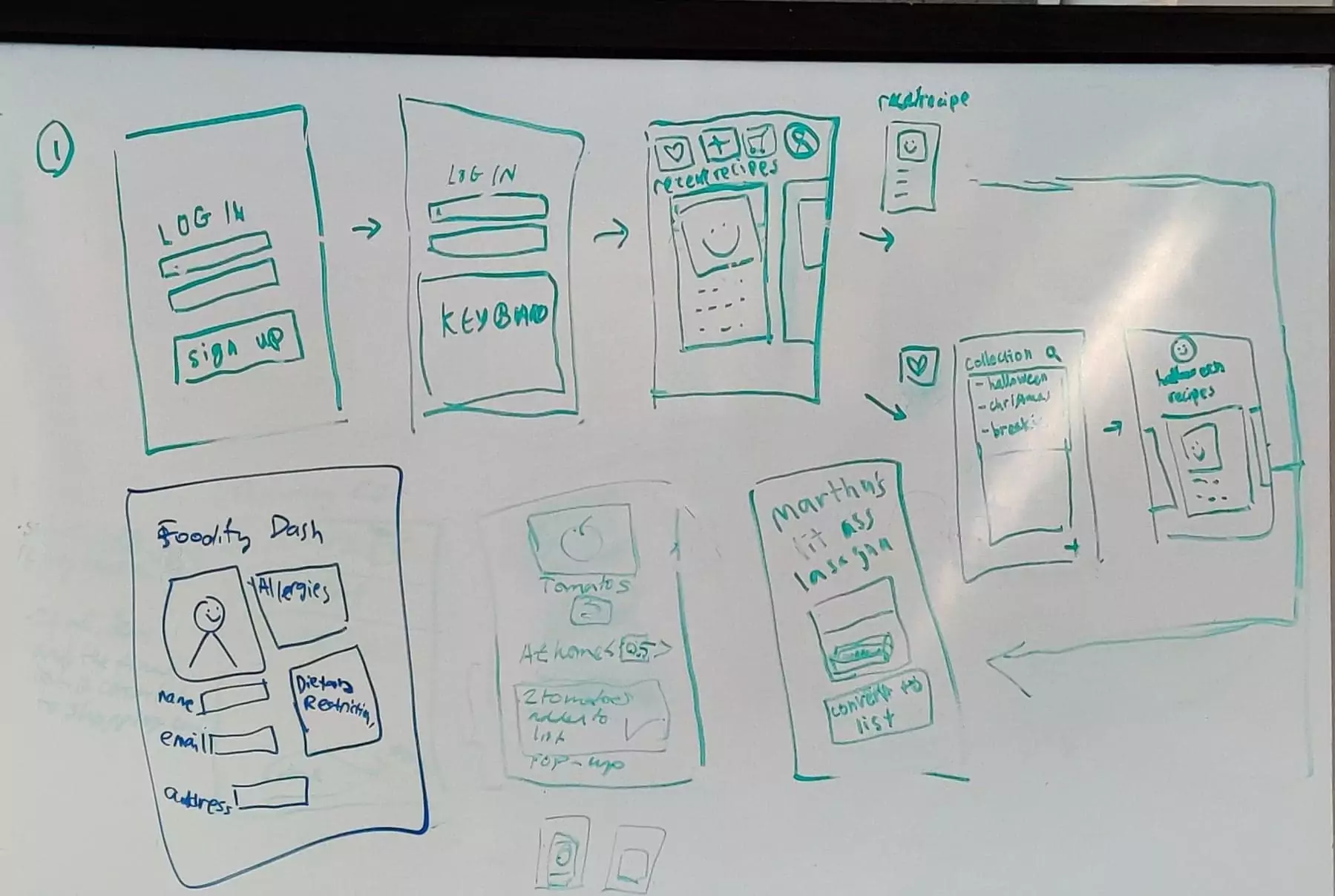
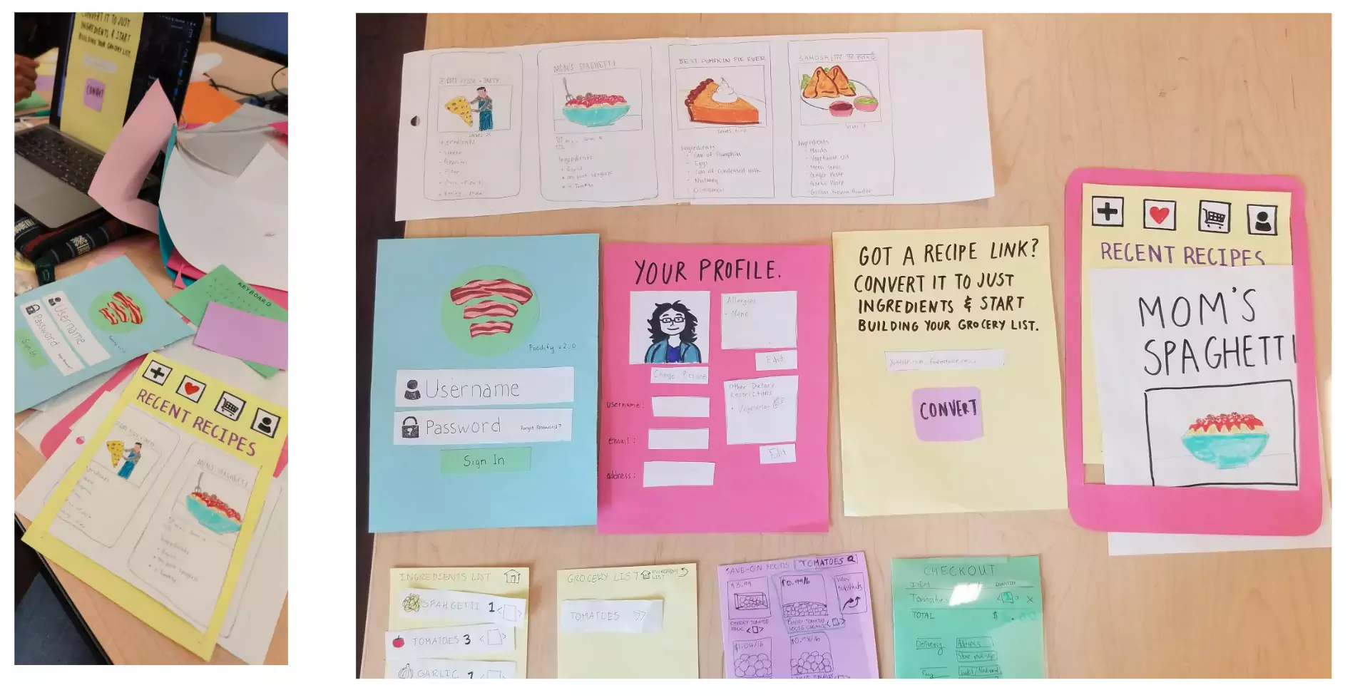
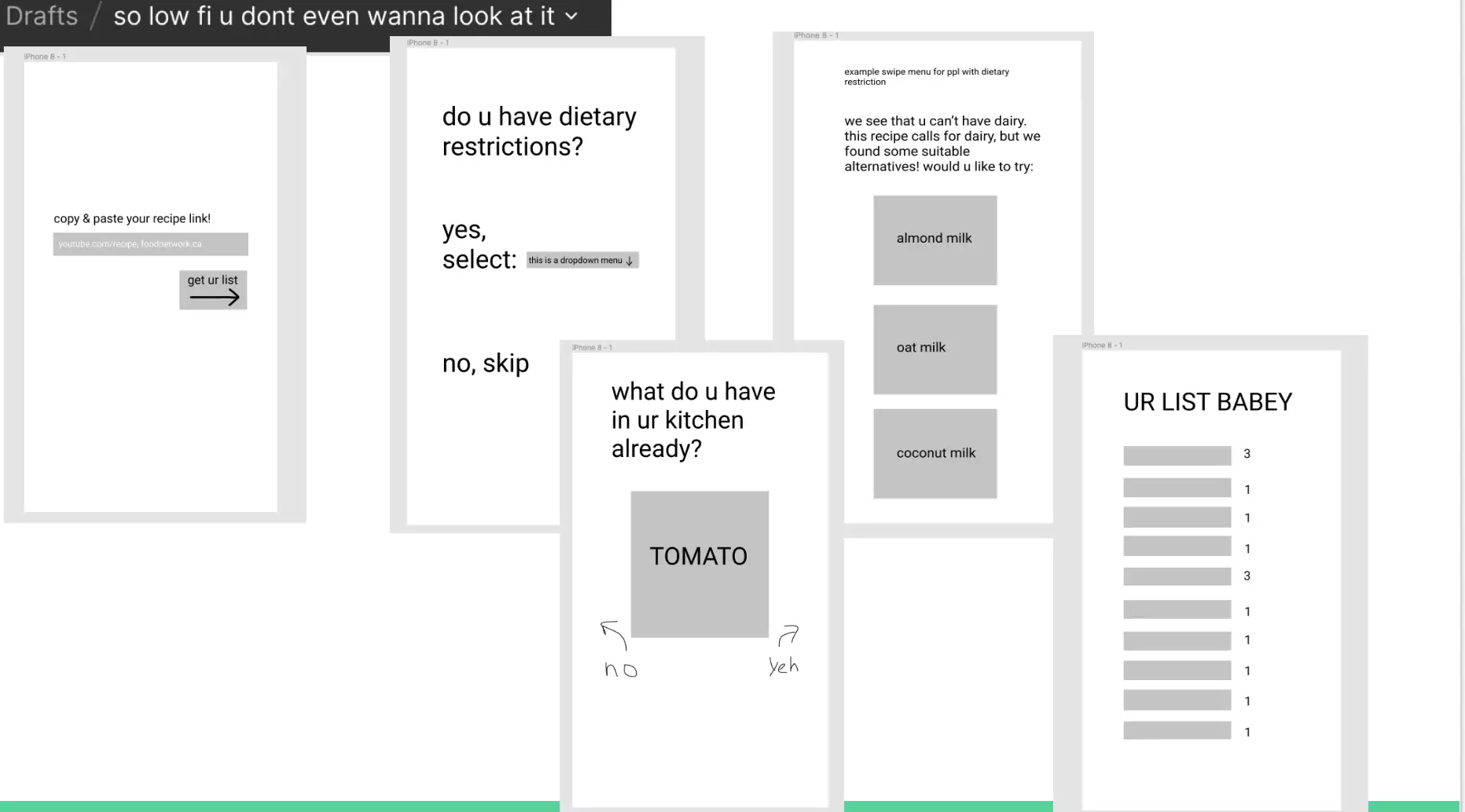
Paper Prototype 2 (PP2). Foodify V2.0
The team brainstormed and considered workflows by implementing informal layouts of the interface in Figma. Like the mock up made in XD, the Figma mock up allowed for understanding how users might move from subtask to subtask. The next step was to focus on feature visibility and aesthetic considerations through whiteboarding, allowing for ideas to emerge from the group. The paper prototype was an integration of the Figma prototype and whiteboarded ideas.
Paper Prototype Findings
After doing cognitive walkthroughs, we evaluated the good and bad of the two paper prototypes as well as approaches.
We found that both had an intuitive user flow, going from screen to screen in a sensible way, with menus that made sense. Both had good, uncluttered interfaces. We found that PP2 also had a lot of safety checks to make sure the user hasn't made any mistakes.
Both PP1 and PP2 had issues which needed to be addressed. We found that PP1 had some issues with signifiers—we found that PP1 had an erroneous signifier in how we used radio buttons instead of checkboxes (an error made on transitioning from idea to paper) and PP2 had a missing signifier on how to use the swipe affordability. PP1 missed out on dietary restrictions — this is likely due to the task example differences (Martha's story made no mention of allergens or dietary restrictions). This immediately stood out to us and showed how important diverse personas can be. With PP2, we found that there were too many nested screens.
High Fidelity Prototype
With all the information gathered from our initial paper prototyping, we set out to create a high fidelity prototype in Figma. We decided to limit our scope to what we identified as the key tasks that users would want, and need, to complete using the interface. In short, we wanted at least the following:
- Browsing existing recipes
- Creating recipes from external sources
Participant Evaluation
We recruited 7 undergraduates to be participants in our user evaluation. They all fit our basic requirements of having some level of expertise with online shopping. We aimed to understand how efficient and understandable the interface was for users. With our prototype, we wanted people to save time, be accounted for in regards to diverse needs and have an enjoyable time while using it. With that in mind, we created and had our participants run through 2 tasks:
Task 1
Signing up and creating a new profile as a lactose intolerant person, converting a recipe URL into a grocery list and then changing quantities of the generated grocery list based on the availability of ingredients already at home.
Task 2
Searching for already existing recipes and then filtering the results based on meal-type, price, and cuisine.
Review Process
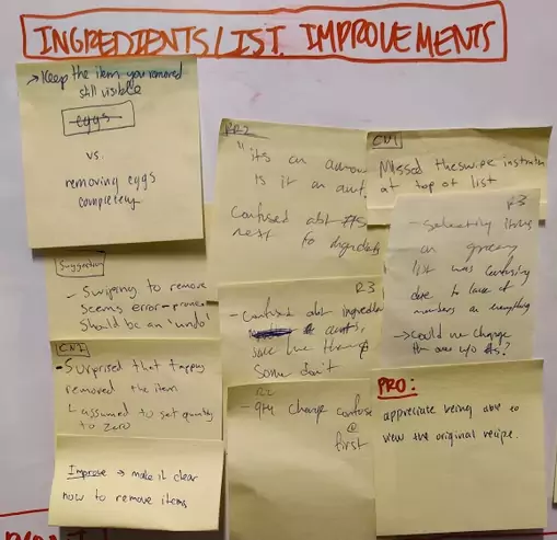
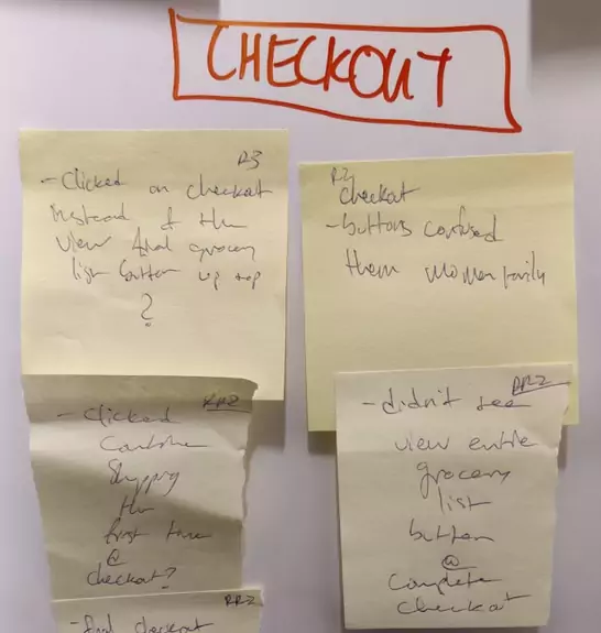
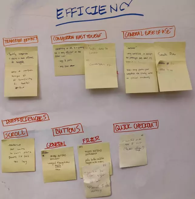
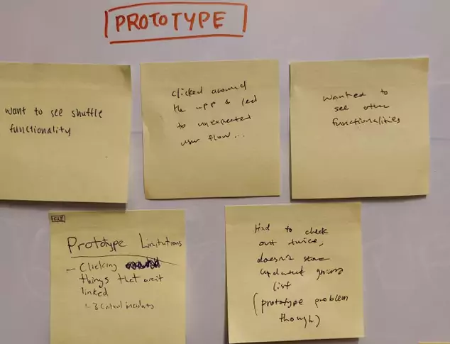
We had our participants go through a mocked up prototype (a very low fidelity one) and using their feedback, made affinity diagram. In doing so, we found some general trends in what we did well, and what needed to be reworked.
Conclusions
The design successfully met our evaluation goals and user expectations.
Overall Experience Ratings
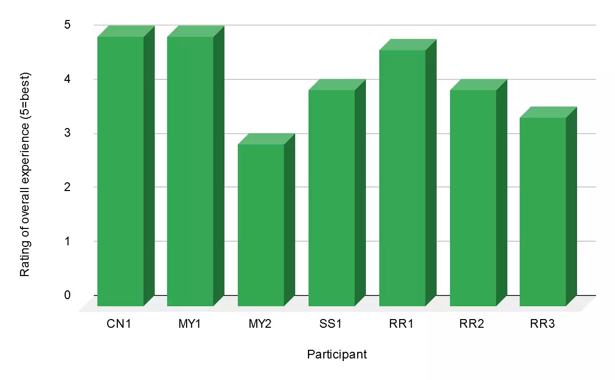
Average: 4.2/5
Mode: 5
Median: 4
Overall Efficiency User Ratings
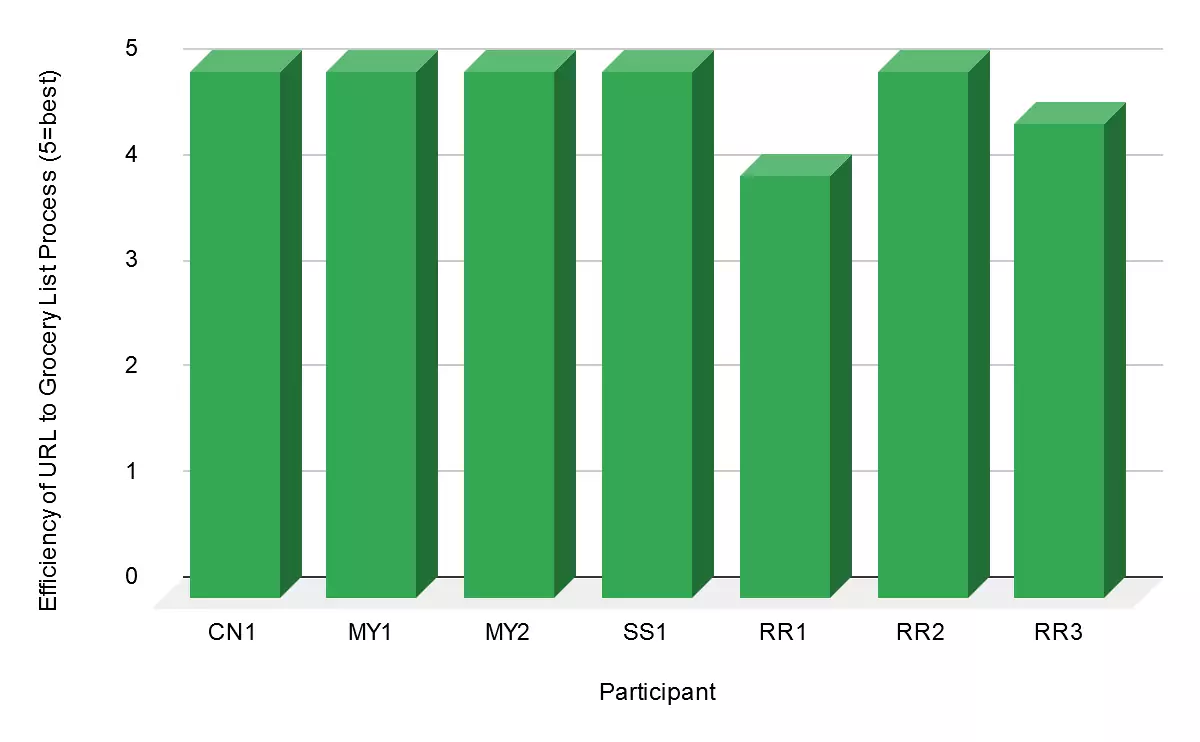
Average: 4.8/5
Mode: 5
Median: 5
Grocery List Subtask User Flow Efficiency
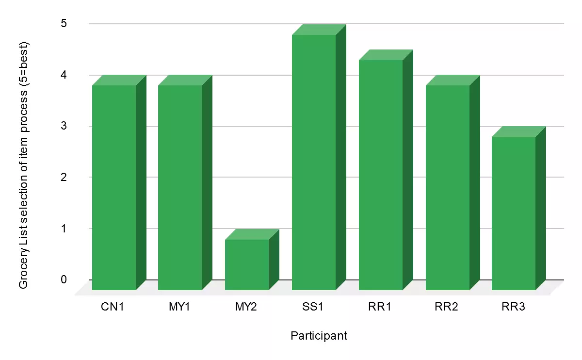
Average: 3.6/5
Mode: 4
Median: 4
Task 1 Time
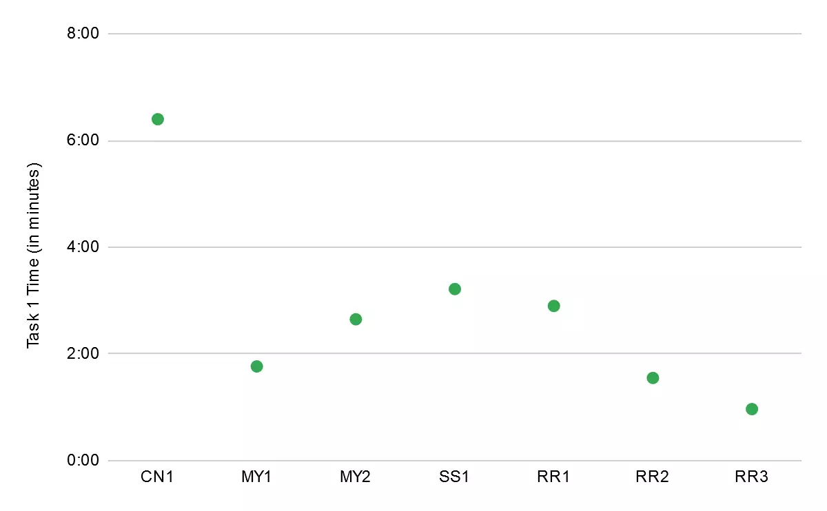
Average: 2:46 Minutes
Task 2 Time
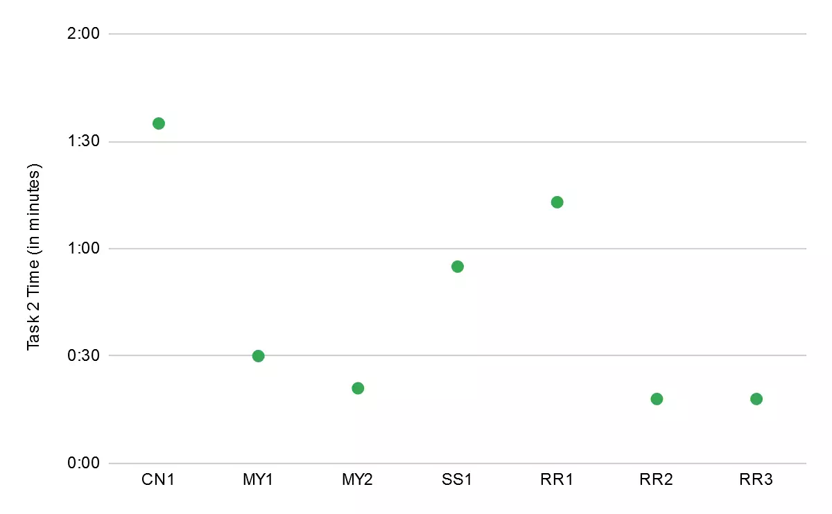
Average: 44 Seconds
Evaluation Findings
From our evaluation, we noted that:
+ The general workflow/user-flow made sense to our participants.
- There are problems with how the ingredients list and checkout page were laid out. There were areas
that more intuitive signifiers could have been added for users to more efficiently update/remove
items from their ingredient lists.
Challenges, Lessons Learned
Throughout this project, I learned a lot about HCI.
By following a pre-design ⇒ early-design ⇒ mid-design ⇒ late-design development pattern, I learned a lot about going from concept to prototype and the overall process of creating a usable design.
Over the course of the project, I learned a lot about the importance of re-iteration informed by feedback (evaluations, heuristic evaluation, cognitive walkthroughs, etc.) in user-centered design. Going through feedback and evaluation results as a team helped us aspects of our interface that we may not have thought about had we not iterated on the design through task based walkthroughs and participant evaluations.
This project was a great case study in putting theory to practice, and learning the tools.
